
Context & Methodology
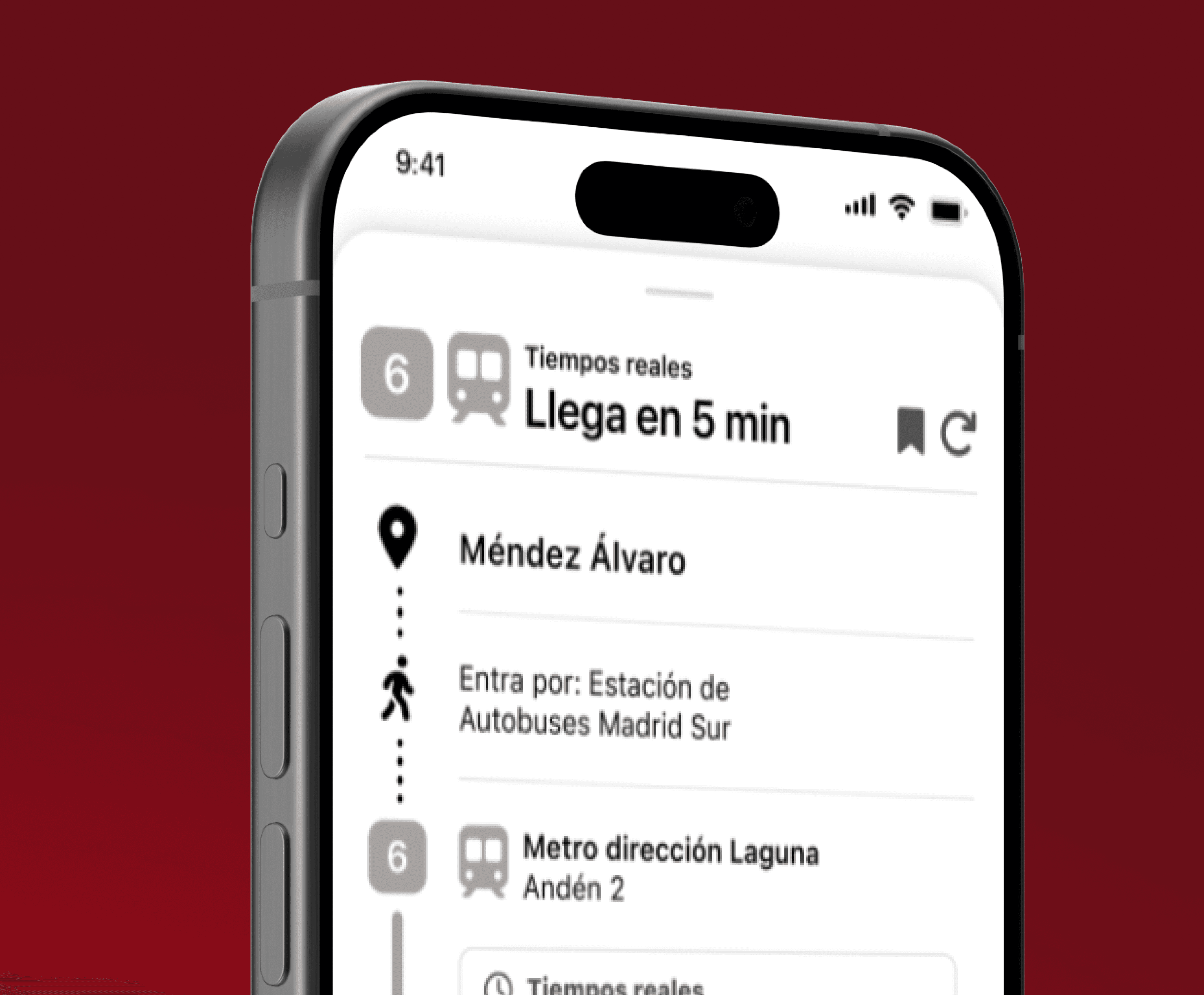
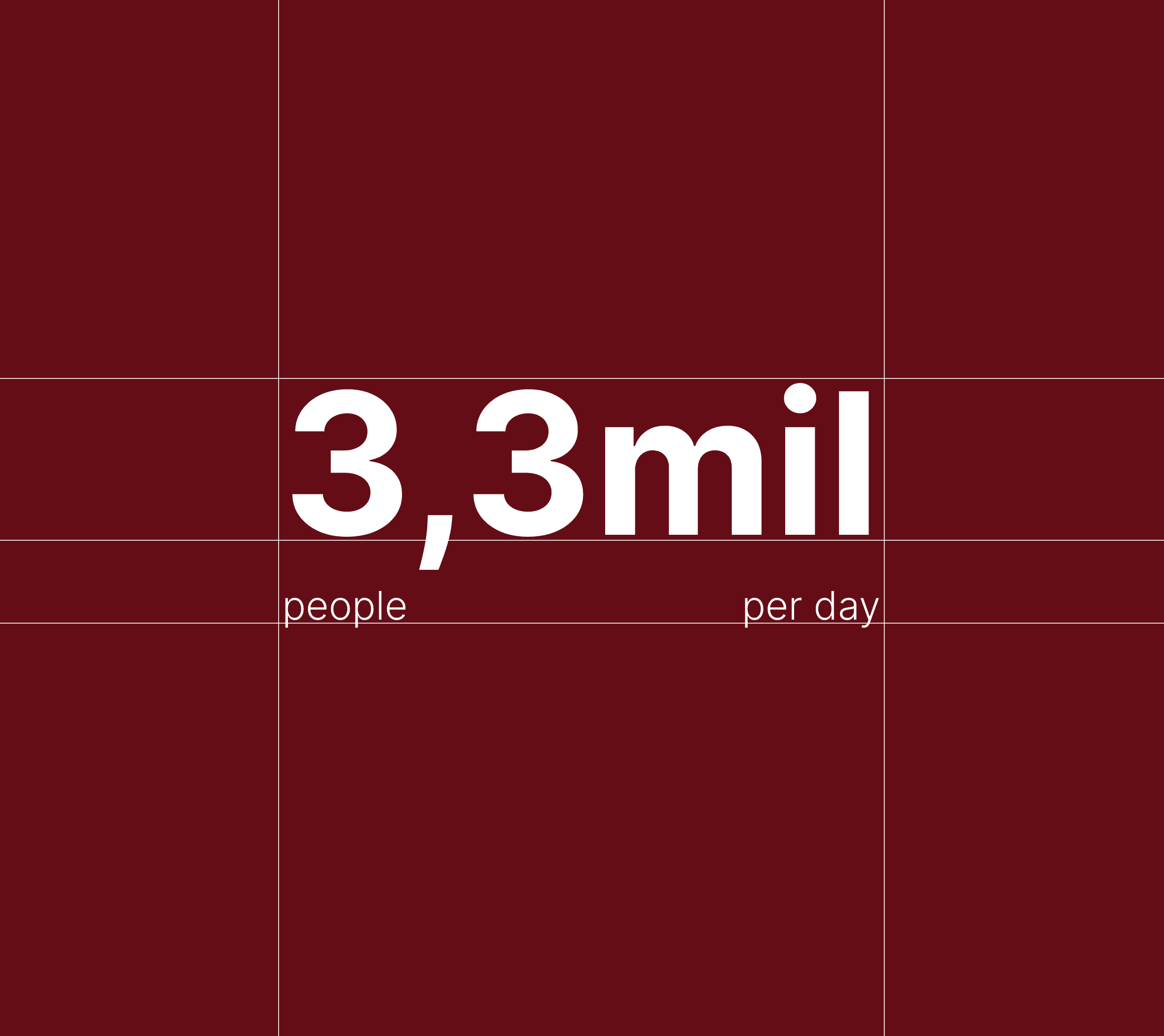
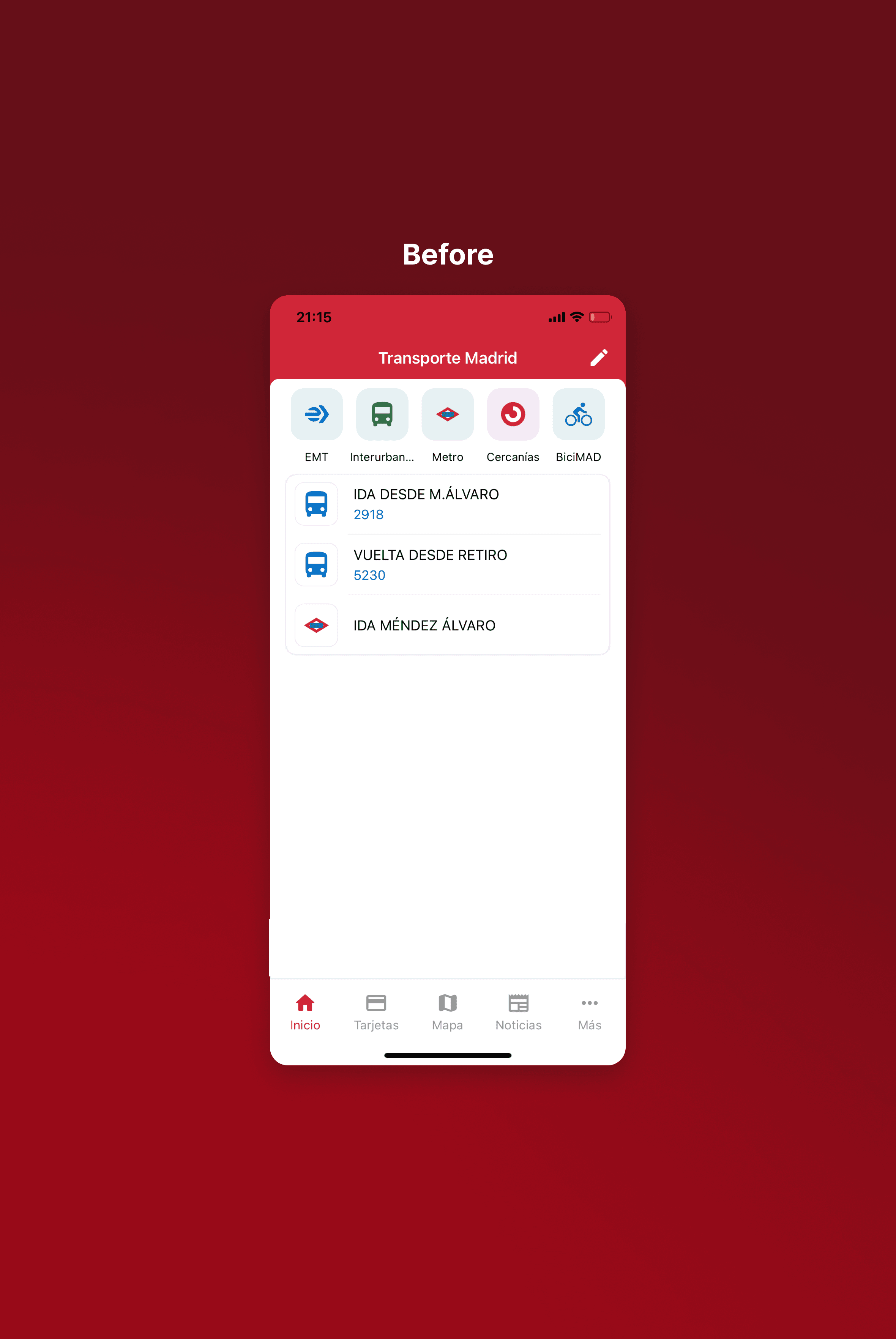
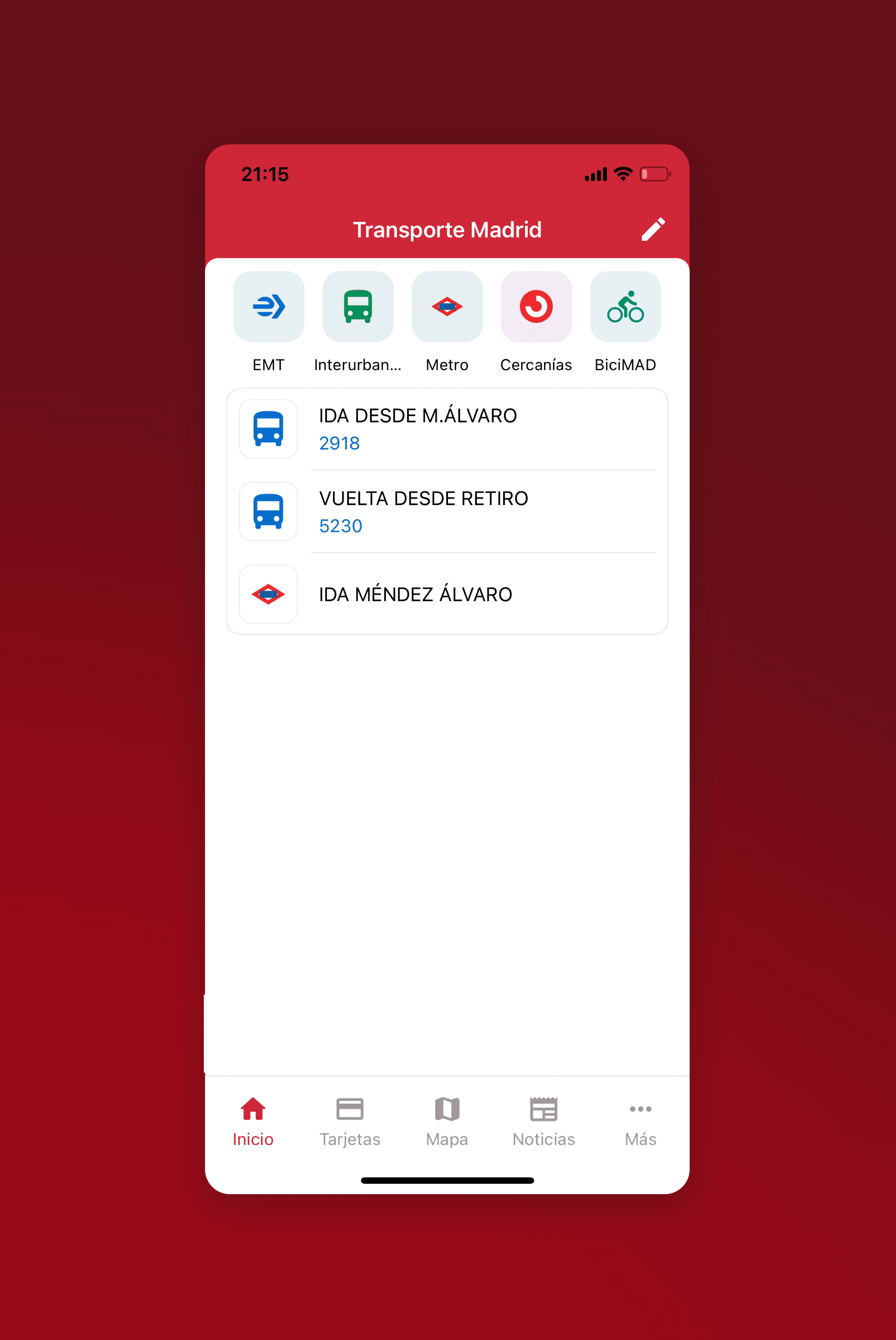
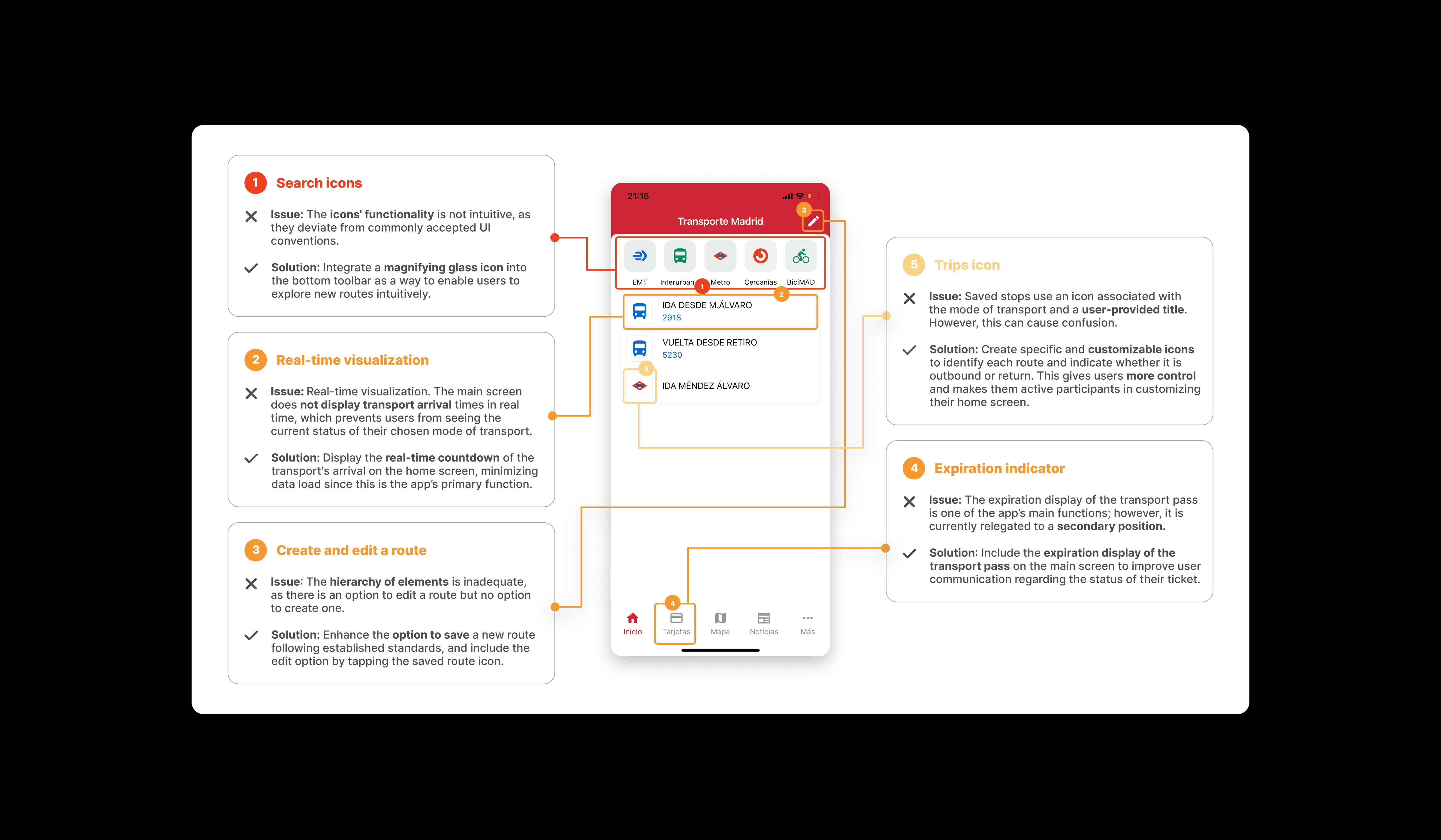
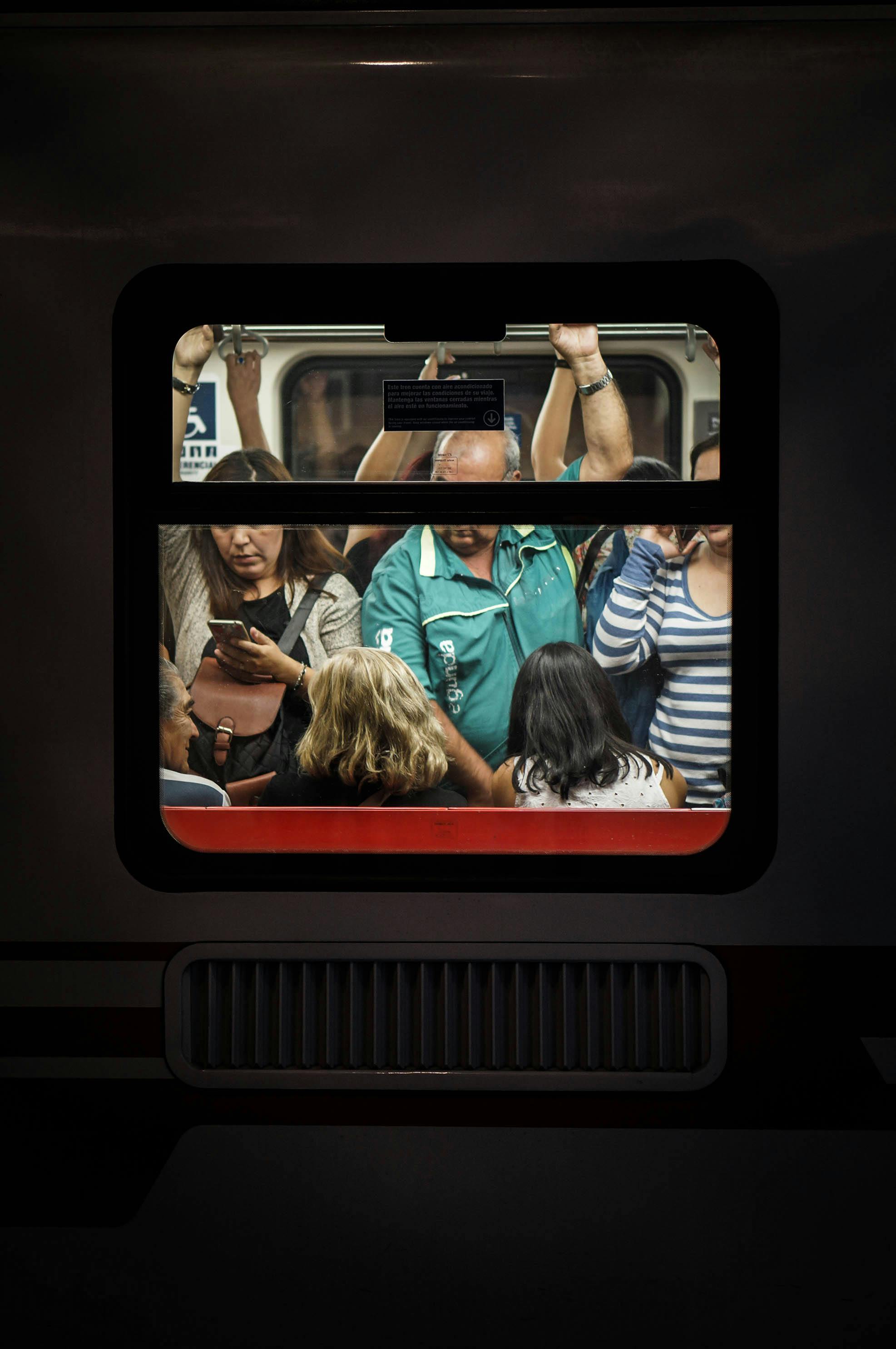
With over 3.3 million daily users relying on public transport in Madrid, the need for a functional, user-friendly digital experience is greater than ever. Despite its potential, the original Transportes Madrid app fell short in several key usability areas, making everyday commuting frustrating. As both a regular user and a UX designer, I applied Nielsen’s Heuristics to evaluate the app’s shortcomings and uncover critical pain points. This analysis became the foundation for a redesigned user flow, supported by low- and high-fidelity wireframes that prioritize clarity, personalization, and real-time information access.


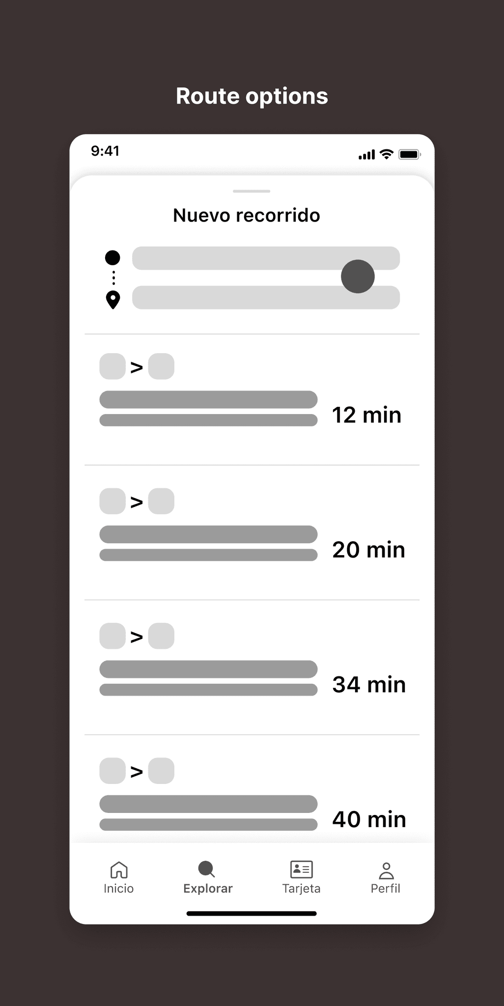
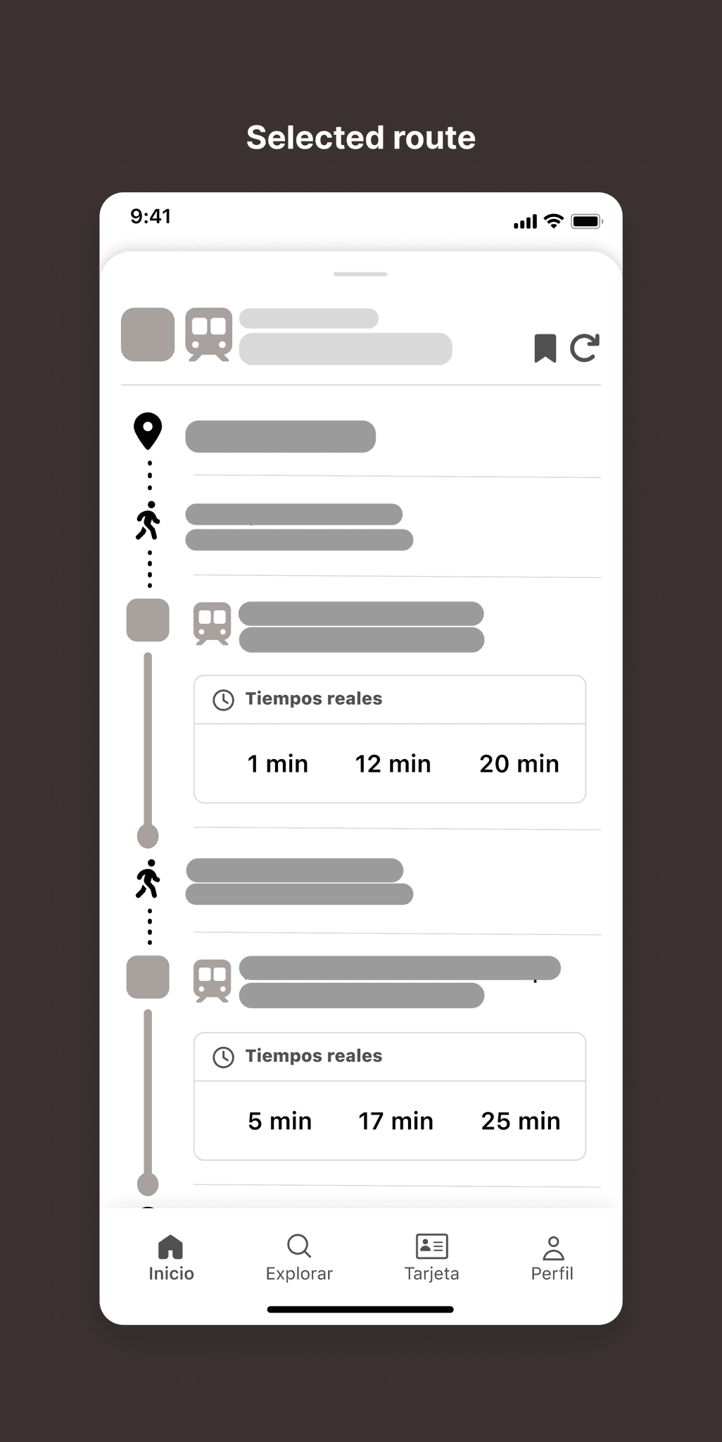
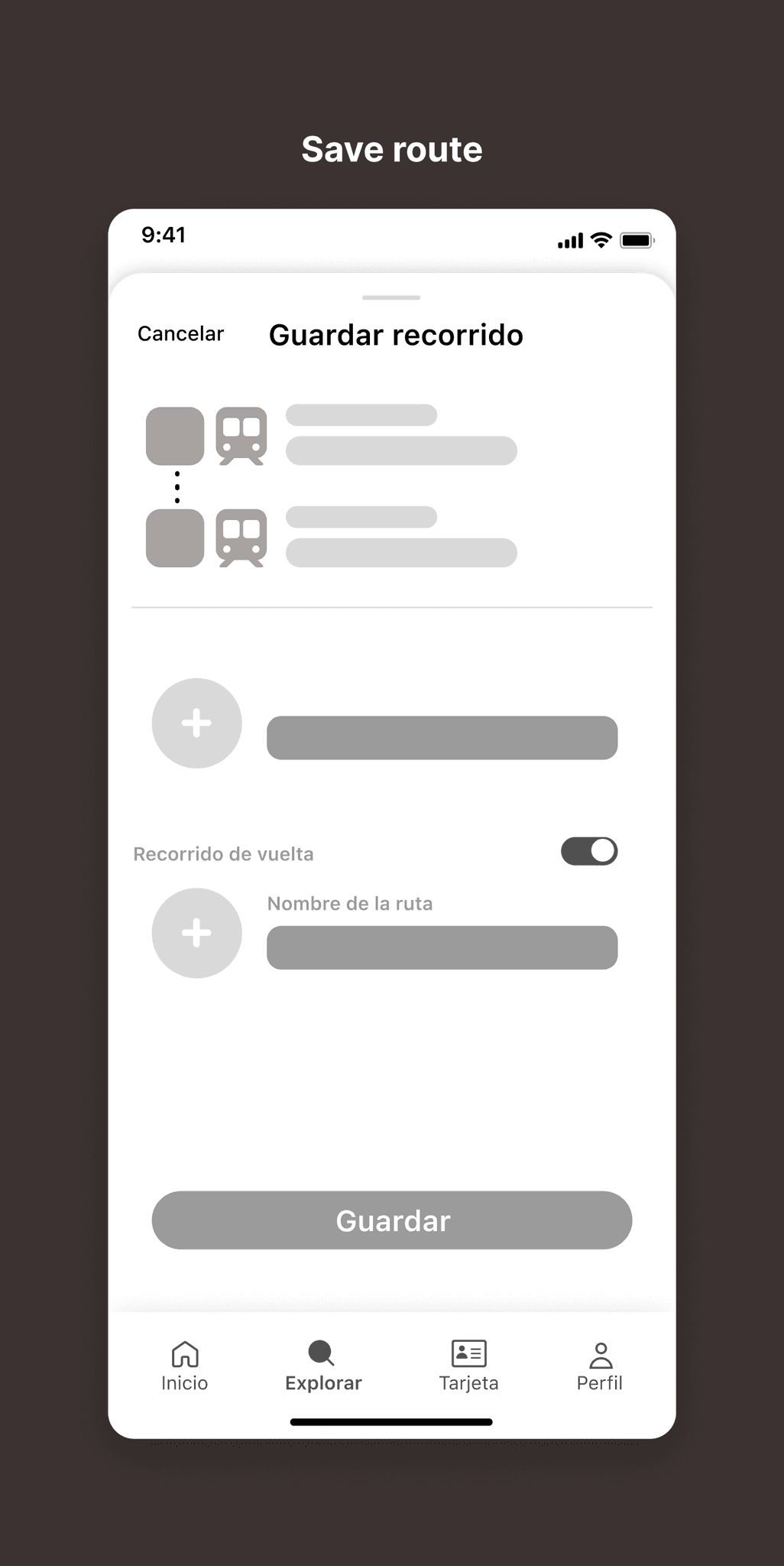

Key Improvements & User Impact
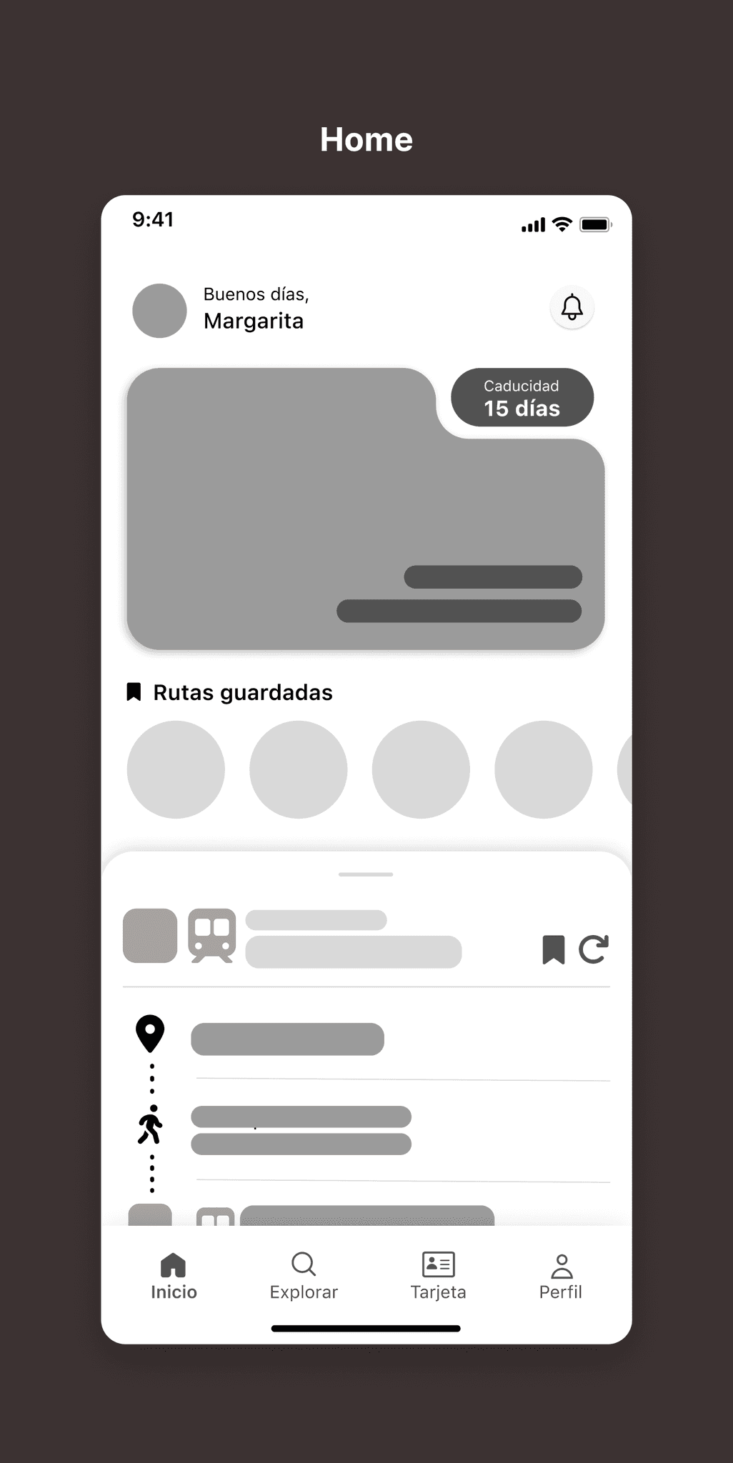
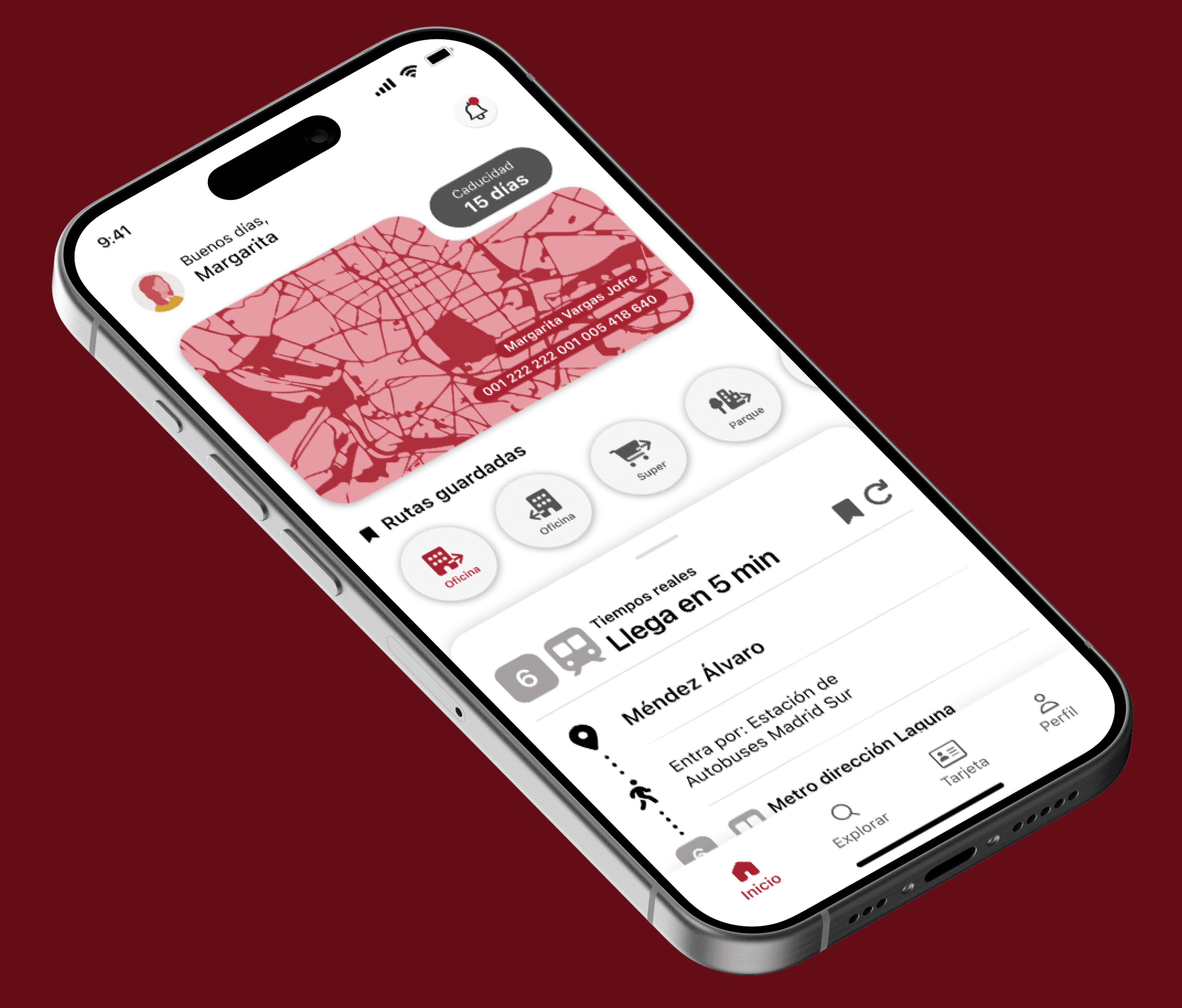
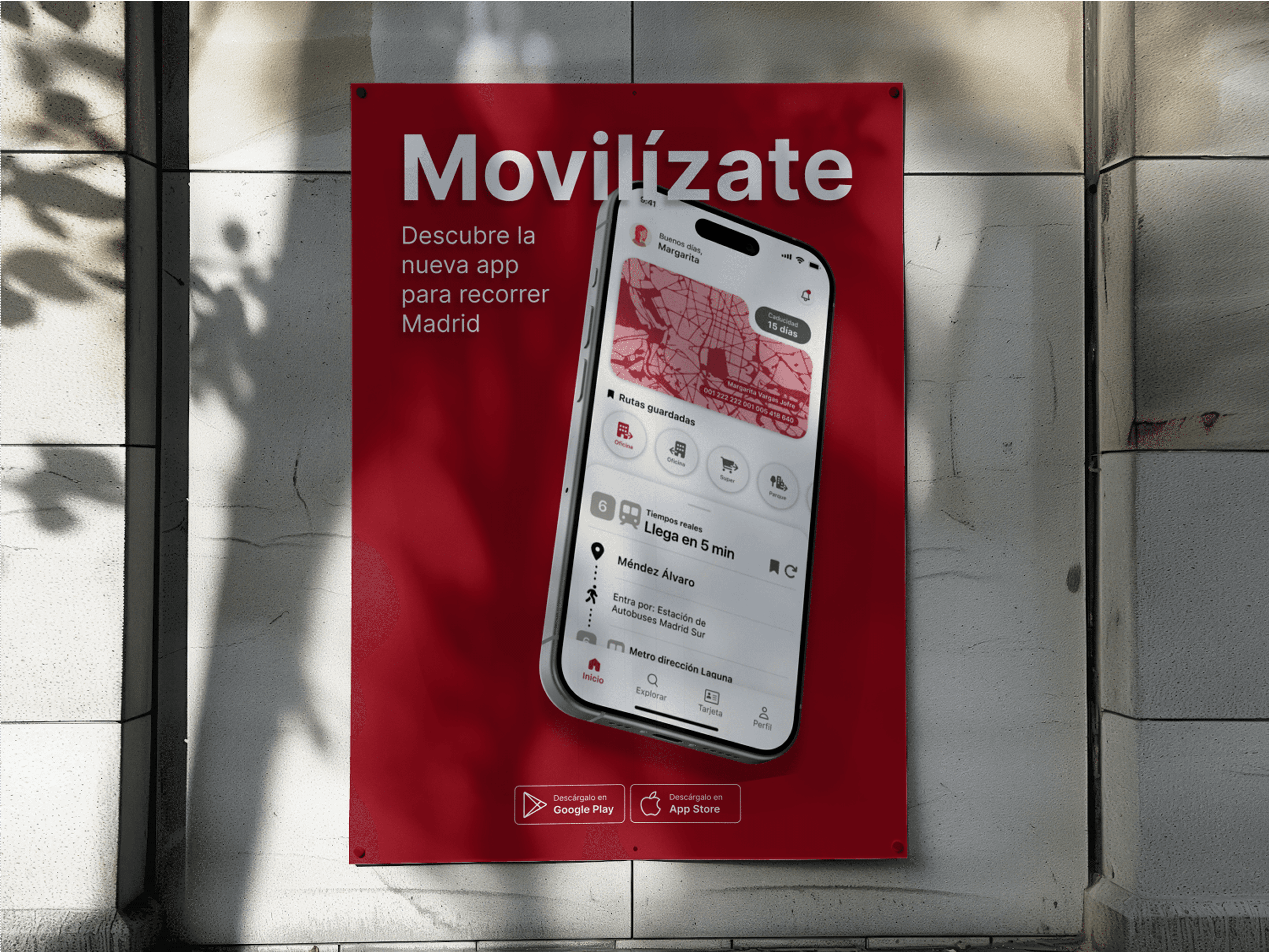
The redesigned experience simplifies core interactions—allowing users to save frequent routes, access real-time transport updates, and personalize the interface with clear icons and visual hierarchy. Improvements include an intuitive search bar, editable route shortcuts, and a streamlined process to save and customize journeys. These updates reduce user error, increase confidence, and support a smoother daily commute aligned with the needs of Madrid’s urban mobility ecosystem.